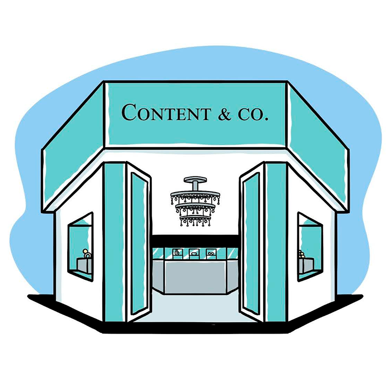
As SAP CMO Jonathan Becher famously stated, “…big glass buildings don’t buy software, people do.” So why do so many marketers still act as though they’re selling to big glass buildings? It’s time to humanize #B2B marketing. It’s time to create content that speaks to people and their needs, behaviors, and points of pain. Good marketing should provide value and offer experiences that make the audience want to look, want to read, want to engage.
Visual design is one of the most powerful tools marketers have for connecting with their audiences on a human level, engaging the senses, and driving action. Humans are inherently visual learners. Smart marketers appeal to their audiences with a variety of visual content including:
- Images and pictures. Articles with images get 94% more views than those without.
- Videos. Seventy-five percent of executives watch work-related videos at least once a week.
- Slideshows. Slideshare is used by business owners and business executives at a rate 5 times that of any other social network.
- Infographics. Businesses who market with infographics grow in traffic an average of 12% more than those that don’t.
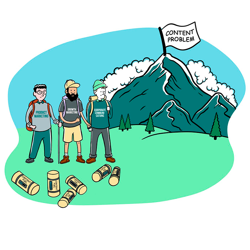
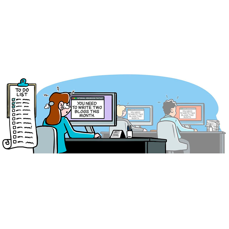
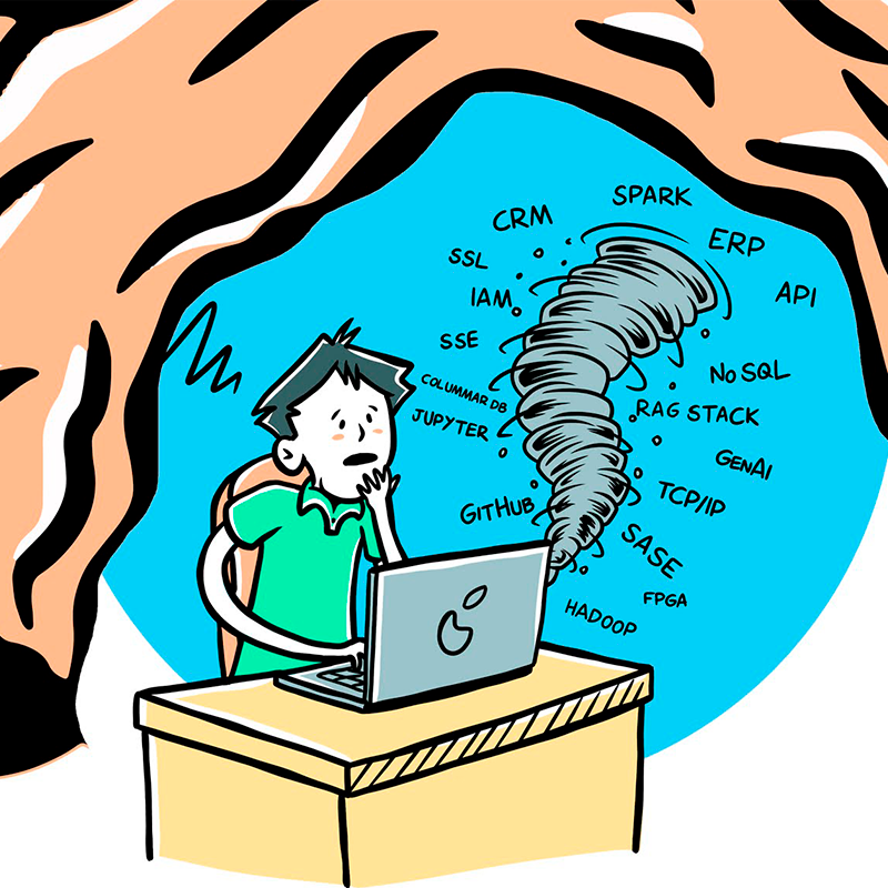
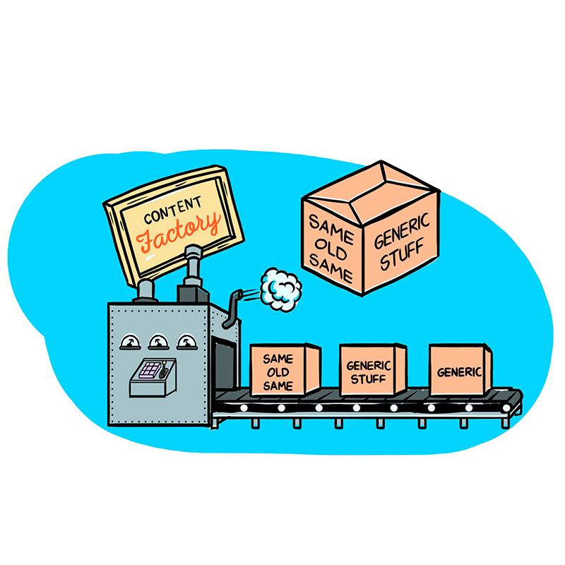
- Comics. Humor has the potential to humanize a brand’s voice, evoke a positive emotional response, and build the audience’s trust.
Visual content is clearly an effective tactic marketers can use to reach and engage their audiences, but not all visuals are created equal. Here are 5 quick tips for creating better visual content:
1) Be a visual storyteller. What kind of story are you telling? Think about the journey you want your audience to take and underlying emotions, and let those elements guide your visual design.
2) Consistency is key. Stay on brand with your visuals. Strong visual branding reinforces your identity and helps you gain recognition from your audience.
3) Make it scannable. Create content that is easily digestible at a glance. For longer content, use different text treatments and graphic elements to highlight key points. Your audience can scan first, and then go in for a deeper dive.
4) Keep ‘em guessing. Use design to evoke your audience’s curiosity. Drive them down a path towards deeper understanding of your company, product or services, and how you can help them solve their problem or challenge.
5) Awaken the senses. Design to appeal to your audience’s senses. Use graphics and photos that evoke a visceral response. Consider the difference between a static product architecture image compared with a dynamic slide that incrementally builds an image out of individual components.
In the oversaturated landscape of B2B marketing, dry and emotionless just won’t break through the noise. Marketers need human connections with their audiences. In order to build human connections, we must appeal not only to audiences’ practical needs, but also to their human sensibilities. Strong visual content makes an instant impact, holds the audience’s attention, and elicits a response.
Also published on Medium.


